InDesign Portfolio
Calendar:
The design I decided to create for the Humane Society calendar was simple but would appeal to the consumers eye. I wanted the calendar to be sophisticated but I wanted the images to portray an aspect of what animals are at the humane society. I chose to use a different animal for each month. For October I chose a dog, November a cat, December a rabbit, and January a horse. I did this because when most people think of the humane society they think of adopting dogs, they seem to forget about all the other animals that need a home. I chose a different background color that would relate to each month but left the opacity at 50% to make sure not to distract from the actual calendar. I then put the words on top. When I thought about the type for the words I wanted to leave it black and bold. I added stroke to the images and it pulled the calendar all together. I made sure to also use the same format for each of the pieces. This way they look uniform. When I created the coupons I left it simple with bold words highlighting the deal and an image to display what was to offer. I felt that the calendar came out great!
Event Poster:
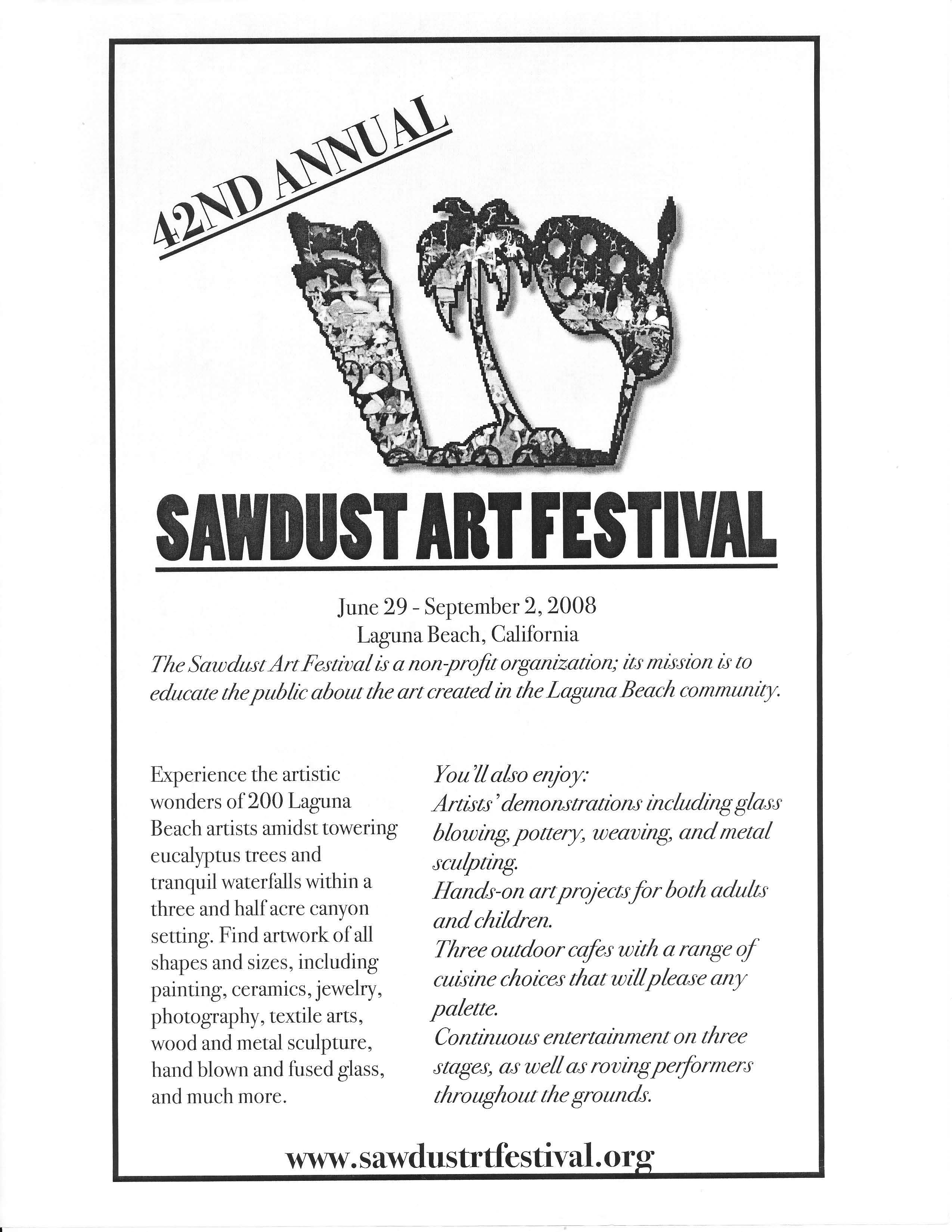
The design I decided to create for the Sawdust Art Festival was simple but conveyed what they're about. I wanted the design to be easily noticed but I wanted the image to portray an aspect of what they're festival is about. I chose to use a paint palette, a palm tree and a saw for their logo. I completed this in Photoshop. I found three different images and created them into one.The paint brush I chose because it represents art. The palm tree represented the location, Laguna Beach CA. The saw was used for the "Sawdust".I then filled the image with an actual photograph from last year's festival.I put a stroke on the images to pull them all together. I chose a yellow design as the backdrop because it seemed creative but simple enough to leave the design of the company the main focus.It was also a color that was in the image. I made sure of the opacity of the image below was low enough to not be too distracting, therefore I put a gradient on the page.The text was left in black to look uniform. I loved this flyer and hope it will get used one day for the Sawdust Festival.
Menu:
The design I decided to create for the Hollywood sandwich shop was quite simple but easy to read. I wanted the logo to be easily noticed but I wanted the image to portray an aspect of what their company does. I chose to use stars to embellish their logo because when I think of hollywood I think of celebrities and stars. When I thought about the type for the words I wanted to leave it black and bold, considering that the company wanted to be able to print it in black and white. I then decided to leave the menu without pictures to leave it simple and just focus on what product and text that they are selling. This is what I feel is best to catch the consumer's eye. I made sure to use the same font for each of the text this way it was unified and the text was not scattered. I emphazixed titles using bold and italics. I really enjoyed working on this project!
Contact Me
Questions?
streckfusam@g.cofc.edu